True Nature Coaching
Enhancing True Nature Coaching’s Brand & Refining User Flow for an Intuitive Experience (In progress)

Client
True Nature Coaching
Year
2024-Present
Main Tools
Adobe Illustrator
Adobe Photoshop
WordPress (Elementor)
Figma
HTML, JS & CSS
My Role
UX/UI Designer
Product Designer
Creative Researcher
Overview / Brief
True Nature Coaching is a coaching company dedicated to personal transformation through nature-based experiences. This project encompassed the full development of its brand identity and digital presence, ensuring alignment with the company’s mission to inspire growth, clarity, and well-being. My role as a UX/UI & Product Designer was to craft a cohesive brand identity and design an intuitive, conversion-driven website that educates users, simplifies the booking process, and enhances client engagement. The challenge was to create a visually compelling and highly accessible platform that fosters trust while guiding users seamlessly through the coaching journey.
Challenges
The primary challenge was twofold:
Educating users unfamiliar with the benefits of coaching and establishing a unique brand presence in a competitive market. The website needed to be more than just an informational platform, it had to function as a trust-building and conversion-driven tool, guiding potential clients through the awareness, consideration, and booking phases with minimal friction.
Additionally, accessibility and ease of navigation were critical to ensuring a seamless user experience across different devices and demographics.
Goals
To bridge the gap between user awareness and engagement, this project focused on three key objectives:
- Brand Differentiation – Develop a unique visual identity that conveys authenticity, personal growth, and trust.
- Seamless UX & UI – Design an intuitive website with a frictionless booking experience, ensuring users can easily navigate the services.
- User Education & Conversion – Implement a structured content strategy to clearly communicate the benefits of coaching, increasing user engagement and conversions.


Research
Before defining the visual identity and user experience, I conducted thorough research to ensure that True Nature Coaching’s brand and website aligned with the needs and expectations of its audience. The goal was to understand potential clients, their pain points, and the competitive landscape in order to create a design that effectively educates, builds trust, and facilitates engagement.
This research phase involved user interviews, competitor analysis, and persona development, providing insights that shaped both the branding and website experience. Through this process, I identified key challenges, streamlined the booking experience, and established a clear content strategy to bridge the gap between curiosity and action.
The following insights highlight the foundation of the project’s strategy and design decisions.
User Interviews
To gain deep insights into the motivations, concerns, and expectations of potential coaching clients, I conducted qualitative interviews with individuals from diverse backgrounds. The goal was to identify pain points, behavioral patterns, and unmet needs in relation to coaching services.
Understanding the Needs of Potential Clients
I interviewed 10 participants from different demographics, including freelancers, professionals, and students who were either considering coaching or had never engaged with it before. The interviews followed a semi-structured approach, allowing us to explore key themes while also capturing individual perspectives.
Each interview lasted approximately 15-30 minutes, covering topics such as:
Their awareness and perception of coaching
- Barriers preventing them from seeking coaching services
- Preferences in digital experiences for self-improvement
- Emotional and psychological factors influencing their decision-making
Opportunities found
- Implementing flexible, low-commitment options like free consultations, trials, or short-term programs could encourage hesitant users to explore coaching without pressure.
- The platform needs to include clear, digestible content that differentiates coaching from therapy and highlights its value with real-life success stories.
- The platform should emphasize a welcoming, non-judgmental environment, using inclusive language, diverse imagery, and testimonials from people with similar experiences.
Persona
Understanding True Nature Coaching’s audience was key to designing a user-centered experience that effectively communicates the value of coaching. Through user interviews and market research, I identified three primary personas, each with distinct needs and expectations. These personas guided the design, ensuring that the website and branding resonated with real user motivations.


Competitive Audit
To design an effective and user-centered coaching platform, I conducted a competitive analysis of industry leaders and adjacent services to understand existing standards, identify market gaps, and uncover opportunities to differentiate True Nature Coaching. The analysis focused on user experience, accessibility, visual identity, and the overall effectiveness of how coaching services were presented.
Findings & Insights
1. Usability & Accessibility
- Strengths: Mobile-first design and structured dashboards improve user experience.
- Pain Points: Complex onboarding processes and inconsistent accessibility features create friction.
- Opportunities: Streamline onboarding, ensure WCAG-compliant accessibility, and introduce personalized coaching recommendations.
2. Brand Positioning & Tone
- Strengths: Top competitors use clear brand narratives and psychology-driven messaging.
- Pain Points: Many platforms feel overly corporate or clinical, making coaching seem intimidating.
- Opportunities: Humanize the brand with storytelling, testimonials, and a friendly, approachable tone.
3. Service Structure & Differentiation
- Strengths: AI-driven personalization and subscription-based coaching are industry norms.
- Pain Points: Rigid pricing models discourage first-time users from committing.
- Opportunities: Introduce flexible payment options, free discovery sessions, and hybrid learning models.

Key Takeaways
From this research, I identified that True Nature Coaching has a unique opportunity to position itself as a highly personalized and inclusive coaching platform. By addressing the major pain points seen in competitors, complex onboarding, rigid pricing, and overly corporate branding. The platform can differentiate itself as an intuitive, flexible, and user-centered solution.
The findings from this competitive research directly influenced the branding, user flows, and interface design, ensuring that True Nature Coaching effectively bridges industry gaps while delivering a seamless, engaging user experience.
Branding
True Nature Coaching needed a brand identity that balanced professionalism, warmth, and inclusivity, a space where users could explore personal growth without intimidation. The challenge was to differentiate the brand from traditional coaching services while ensuring credibility and approachability.
The branding strategy was shaped by three pillars:
- Authenticity – A brand voice that feels human, encouraging genuine connections.
- Clarity – Simple, intuitive messaging that removes the mystery around coaching.
- Empowerment – A visual identity that reflects growth, resilience, and transformation.
Logo Concept
The logo was designed to reflect the core philosophy of True Nature Coaching: growth, resilience, and harmony. Each element has been carefully considered to reinforce this vision:
Nature-Inspired Elements
The logo integrates organic shapes and natural motifs, such as trees or leaves, symbolizing growth, renewal, and the continuous journey of self-improvement. These elements create a sense of grounded stability, reassuring users that they are in a safe and nurturing environment.
Circular or Flowing Forms
If the logo incorporates circular elements or fluid lines, these represent balance, continuity, and transformation—a visual metaphor for the coaching process, where individuals evolve at their own pace.
Flow & Movement
Subtle organic curves and natural flow within the design emphasize adaptability, flexibility, and personal evolution, mirroring the brand’s coaching philosophy.


Typography
To complement the brand’s mission, DM Serif Display was chosen as the primary typeface. This selection was deliberate and strategic, balancing credibility with warmth:
- DM Serif Display brings a sense of elegance and trustworthiness, positioning the brand as serious and knowledgeable, but not overly corporate.
- The subtle curves and soft serifs introduce a welcoming and human-centered aesthetic, making the brand feel approachable and empowering.
- When paired with a modern sans-serif for body text, the combination ensures clarity, legibility, and an intuitive reading experience across digital platforms.
Color Palette
The autumn-inspired color palette embodies the essence of True Nature Coaching, creating an emotional connection to nature, growth, and transformation. Each hue was carefully selected to reflect the brand’s core values and to evoke a sense of trust, warmth, and renewal.
- #091728 (Deep Navy): Represents depth, wisdom, and introspection, reinforcing a sense of trust and stability.
- #cf6928 (Burnt Orange): Symbolizes energy, warmth, and transformation, mirroring the personal growth journey.
- #94665a (Earthy Brown): Grounding and stabilizing, this shade reflects resilience and a deep connection to nature.
- #d4a76c (Golden Beige): A touch of warmth and balance, adding a sense of harmony and openness to the brand.
- #161821 (Dark Green): Rooted in nature, this color emphasizes growth, renewal, and a grounding presence.
By integrating this earth-toned palette, True Nature Coaching presents a cohesive and inviting visual identity. The colors enhance trust and connection, fostering a calming and approachable experience for clients seeking personal transformation and self-discovery.


User Flow
The user flow for True Nature Coaching is designed to simplify the journey for potential clients, ensuring a seamless and intuitive experience that aligns with the needs, behaviors, and expectations identified in our research. The main objectives are to:
- Facilitate easy booking of coaching sessions.
- Educate users about coaching and its benefits.
- Provide a structured yet flexible path for exploration and engagement.

User Flow
The main goal of the user is either booking a session or learning about coaching before making a decision.
The decision-making flow ensures that hesitant users have supportive content like:
- Blogs & Events to learn more.
- Testimonials & FAQs to build trust.
- The Booking Process is direct but offers opportunities to reconsider before confirming.
The User Flow aligns well with different personas:
- Sarah (Busy Professional) would value structured explanations and a simple booking process.
- Alex (Creative Freelancer) might explore blogs and testimonials before committing.
- Sofia (College Student) would likely check FAQs and testimonials before deciding.
Wireframing
The wireframing process for True Nature Coaching laid the foundation for an intuitive and user-friendly website. Low-fidelity wireframes were created to map out core features and user flows, ensuring a seamless experience from exploration to booking. Key elements included:
- A structured homepage with clear entry points to coaching services and resources.
- A simplified booking interface, reducing steps and friction for users.
- Dedicated sections addressing common questions and misconceptions about coaching, building trust and clarity.
These wireframes evolved into high-fidelity prototypes, incorporating responsive layouts and visual details tailored to the brand’s identity. The final designs ensured consistency and alignment across all devices, paving the way for a smooth development process.
Coming soon
More updates are coming soon! Please, feel free welcome to check my other case studies 🙂


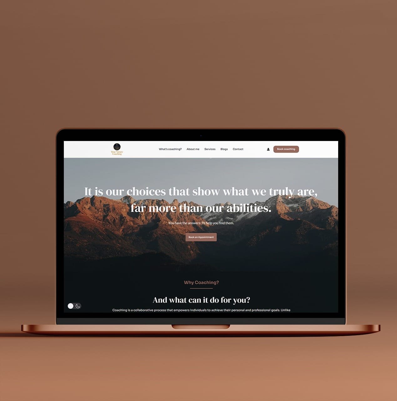
Website Highlights
The high-fidelity prototypes for True Nature Coaching brought the brand’s vision to life through polished designs that combined functionality and aesthetics. These prototypes incorporated:
- Responsive layouts: Ensuring the website delivered a consistent experience across desktop, tablet, and mobile devices.
- Visual hierarchy: Strategic use of typography, color, and spacing to guide users seamlessly through the content.
- Interactive elements: Clickable components to simulate real user interactions, such as booking a session or navigating resources.
- Brand integration: Harmonizing the logo, color palette, and imagery to create a cohesive and emotionally resonant visual identity.
The prototypes underwent iterative testing to refine the user experience and address potential usability challenges before development. This process ensured the final design was both visually appealing and user-centric.
Test Usability
Ensuring an intuitive and seamless user experience has been a central focus of the True Nature Coaching project. Key usability enhancements implemented so far include:
- Responsive design: The website is optimized for desktop, tablet, and mobile devices, ensuring accessibility across different platforms.
- Clear navigation: A simplified menu structure and intuitive pathways allow users to find essential information about services, coaching benefits, and booking with ease.
- Accessible content: Fonts, color contrast, and button sizes were chosen to meet accessibility standards, prioritizing inclusivity for users of all ages and technical abilities.
- Optimized booking flow: The booking system is designed to minimize steps, providing a frictionless scheduling experience and reducing user frustration.
While these usability improvements have been implemented, the project remains a work in progress. Future phases will involve monitoring the website’s performance, conducting user testing, and gathering analytics to refine the experience further and ensure it meets both user and business goals.
Reflection
The branding and website for True Nature Coaching successfully captured the essence of growth, connection, and tranquility while addressing the diverse needs of its audience. The brand identity, anchored by a symbolic logo and an autumn-inspired color palette, created an emotional resonance that set the company apart from competitors. The logo’s thoughtful design, with its integration of nature-inspired elements, became a recognizable and memorable visual marker of the brand’s mission.
The website delivered a seamless and empowering user experience, guiding visitors through intuitive pathways tailored to their goals—whether learning about coaching, contacting the coach, or booking sessions. Metrics like session duration and drop-off rates revealed increased engagement, reflecting the site’s success in fostering trust and providing clear value to users.
This project demonstrated how a multidisciplinary approach combining branding, UX research, and responsive web design can create a cohesive and impactful digital presence. By addressing key pain points and leveraging user insights, True Nature Coaching positioned itself as an accessible and trustworthy resource for personal growth.
Testimonials
My Happy Clients!
INTERESTED IN WORKING TOGETHER?
GET IN TOUCH
CLICK TO COPY
COPIED!🙌