
Mad Hatter Bistro
Mad Hatter Bistro: Branding, UX Strategy & Web Design for a Duo Bar Concept


Client
Mad Hatter Bistro
Timeline
2023-Present
My Role
Led the full brand and digital experience strategy, including naming, visual identity, storytelling, UX/UI design, teaser website, and newsletter automation, guiding the project from concept to public launch.
Main Tools
Adobe Illustrator & Adobe Photoshop
WordPress (Elementor) & Squarespace
Figma
HTML, CSS & JavaScript
Filmora
MailerLite
Google Workspace
Project Overview
Mad Hatter Bistro is a dual-concept bar inspired by Alice in Wonderland, combining a whimsical daytime bistro with a moody, theatrical lounge at night.
Design Challenge
How do you introduce a venue that doesn’t exist yet—and still get people excited enough to sign up for more?
The core challenge was to design an immersive brand experience that would spark curiosity, build a community, and engage users emotionally without revealing too much too soon.
Strategic Approach
What I did and why:
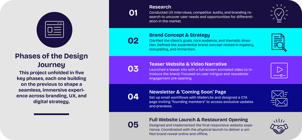
I developed a phased rollout strategy focused on storytelling, branding, and interactive design. Instead of launching everything at once, I guided users through a journey:
Crafted a visual identity rooted in narrative, theatricality, and curiosity.
Designed a teaser website centered on emotional engagement and email capture.
Planned interactive extensions like motion-based storytelling and reservation features for later phases.
Each phase was aligned with a clear objective: intrigue first, conversion second, immersion always.
Results & Impact
Research (Phase 1)
Before designing any visuals, I needed to deeply understand who we were designing for, what they expected from an immersive dining experience, and how to position the brand in a crowded hospitality space.
The goal of this research phase was to ensure every decision, from branding and copy to layout and interaction, was grounded in real user insight and competitive differentiation.
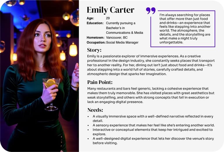
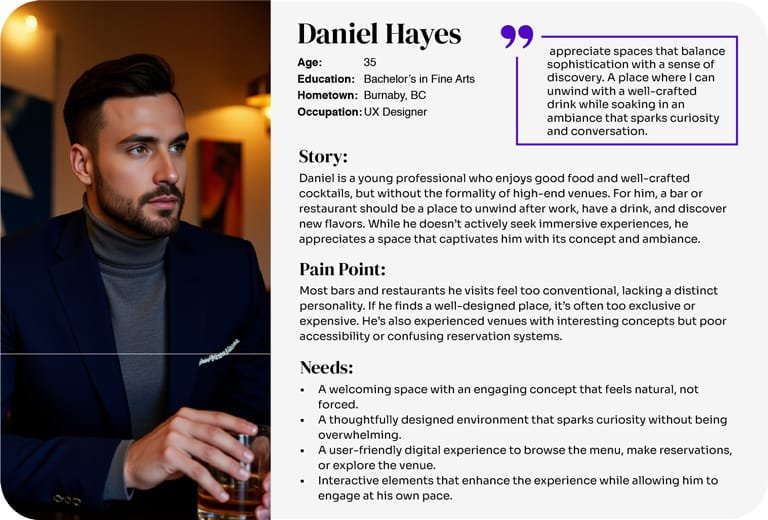
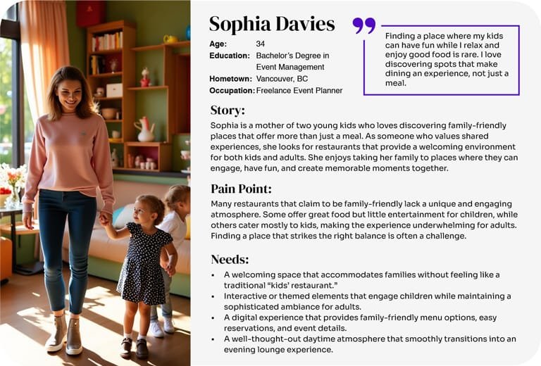
User Personas & UX Interviews
To better understand our audience, I created three user personas based on exploratory interviews with potential customers who value unique dining and immersive environments.
These personas reflected different user types, from curious first-timers to seasoned experience-seekers, and helped define user expectations around mood, usability, and digital touchpoints.
This research directly influenced key decisions, such as using visual storytelling to build intrigue, simplifying navigation, and aligning tone with users’ emotional goals.
Key Insights from User Research
Based on interviews and persona analysis, I identified three recurring insights that directly shaped both the brand identity and the teaser experience:
Users want an experience—not just a restaurant.
They expect the brand to transport them into another world, starting from the first interaction online.Mystery and visual storytelling build intrigue.
Users are more likely to engage if they don’t get all the information upfront, creating a desire to discover more.Mobile simplicity is key.
Users prefer a streamlined experience that feels magical but is easy to navigate, especially on mobile.
These insights influenced the overall narrative structure, choice of language, motion use, and focus on emotional cues rather than traditional navigation.

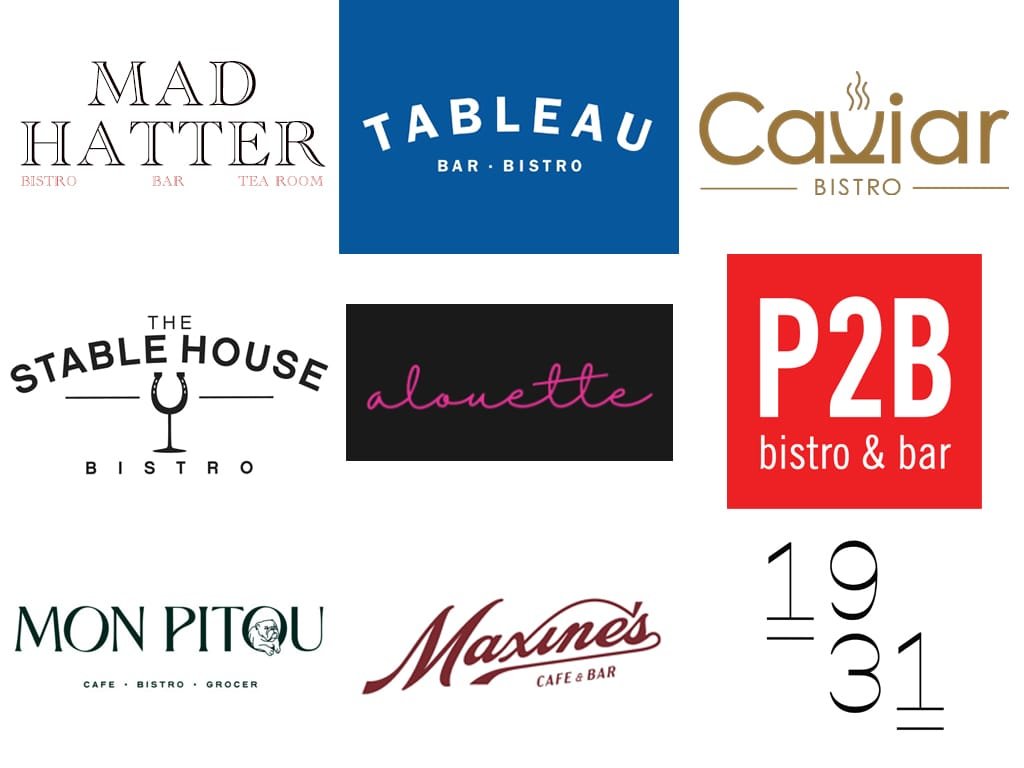
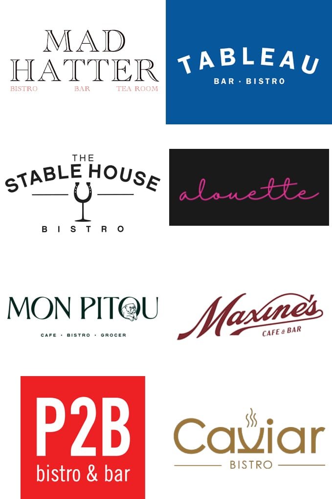
Competitive Analysis
To position Mad Hatter Bistro as a standout experience in a market full of minimalist, static restaurant brands, I conducted a visual and UX audit of both local and international competitors.
Most followed similar trends:
- Logos were purely geometric or wordmarks, with little symbolism
- Color palettes leaned heavily on neutrals (black, beige, muted gold)
- Websites were static, information-focused, and lacked emotional engagement
This analysis revealed a clear opportunity:
Create a brand that feels theatrical, immersive, and emotionally expressive, leveraging vibrant color, storytelling, and subtle interactivity to build intrigue from the first click.
During this phase, I also conducted trademark availability research to ensure the brand name would be both legally safe and distinct.
After evaluating similar names used in Ontario and Ireland, we confidently moved forward with Mad Hatter Bistro, a name that captured the concept’s essence and met legal standards for originality.


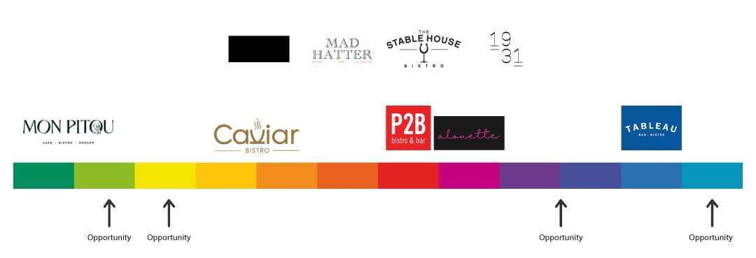
Color Palette Analysis
During the competitive audit, I noticed a pattern: most venues relied on safe, neutral palettes, mainly beige, black, and muted gold. While elegant, they lacked personality and failed to build emotional connection.
This presented a clear opportunity to differentiate Mad Hatter Bistro through vibrant, fantasy-inspired color. I selected deep purples, electric blue, and turquoise accents to evoke imagination, mystery, and energy; all grounded by a dark navy base for contrast and elegance.
These colors were not chosen just for aesthetics; they became key elements in setting the tone of the brand across digital and physical experiences.

Branding & Identity Design (Phase 2)
After uncovering key user needs and identifying a gap in the market, I set out to create a visual identity that felt both magical and refined, capturing the dual nature of Mad Hatter Bistro: whimsical by day, immersive and mysterious by night.
The brand direction needed to evoke curiosity, suggest a story behind the experience, and feel visually distinct from competitors. Every visual decision, color, shape, type, was made to build an emotional connection before a single dish was served.

Logo & Imagotype System
To visually capture the brand’s duality and theatrical nature, I designed a custom imagotype featuring a stylized hat symbol and an expressive serif wordmark.
The hat serves as a key storytelling device, an instantly recognizable icon that reinforces the name and adds character across platforms.
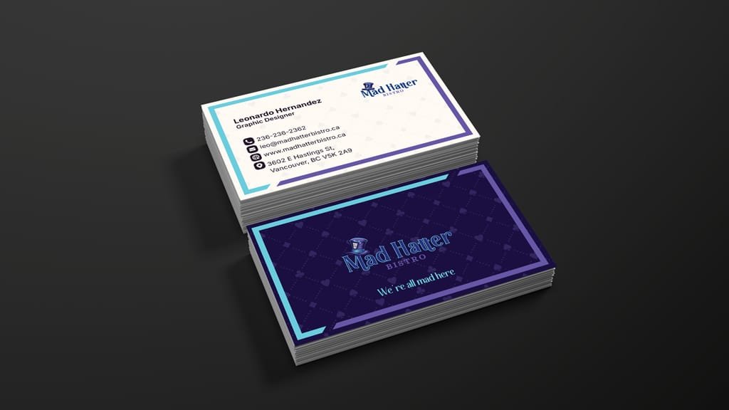
Unlike most competitors that use plain wordmarks, this logo was designed to stand out in both digital and physical environments: signage, menus, social media, packaging, and more. Multiple lockups, including stacked and horizontal formats ensure adaptability across every brand touchpoint.
Color Palette Strategy
Most competitors relied on neutral, minimalist palettes that felt elegant but lacked personality.
To stand out, I crafted a color system rooted in fantasy, contrast, and emotion, inspired by theatrical lighting and surreal visual cues.
Each color was selected for its emotional resonance:
Deep Purple – Creativity, mystery, and imagination
Electric Blue – Energy, contrast, and visual focus
Turquoise – Wonder and playful curiosity
Dark Navy – Sophistication and grounding
Ivory White – Clean backdrop that enhances contrast

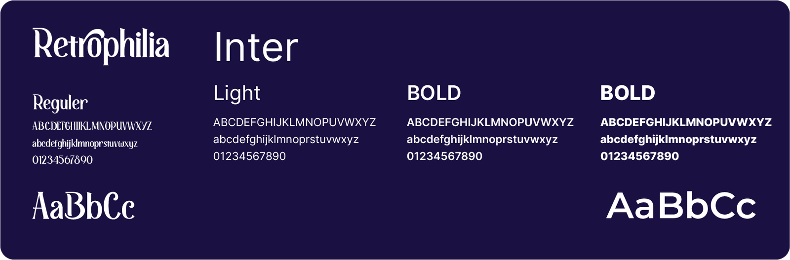
Typography
To reflect the brand’s theatrical flair and ensure usability across mediums, I paired two complementary typefaces:
Retrophilia – An expressive serif used for titles, quotes, and brand moments. Its ornamental curves add personality and align with the immersive, fantasy-driven tone.
Inter – A clean, accessible sans-serif ideal for body copy, signage, and digital UI. It offers clarity and balance, especially on mobile.
This pairing supports both storytelling and structure, maintaining a consistent voice across platforms while enhancing readability and hierarchy.
Brand in Use
The brand system was designed to be both expressive and flexible, adapting seamlessly across digital and physical environments.
From teaser website and social content to print materials and signage, each element reinforces the tone of mystery and elegance while staying functional and accessible.
Every brand touchpoint tells part of the story, contributing to a cohesive experience that starts online and extends into the real world.


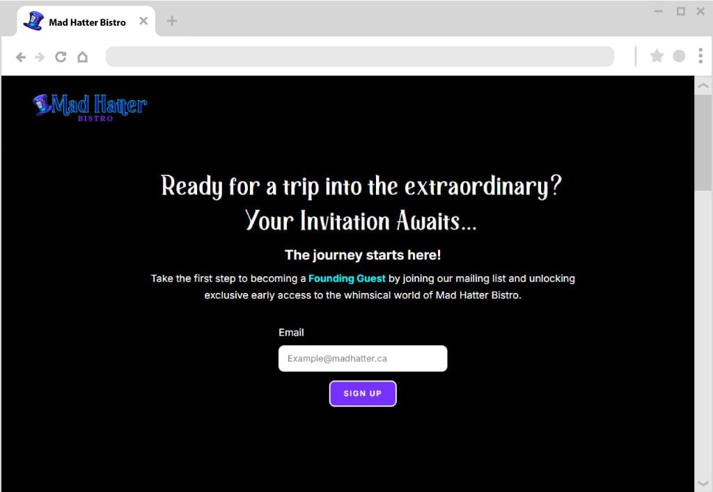
Phase 4: Coming Soon Page
After gaining traction with the teaser site, the next step was to nurture early interest and turn visitors into brand ambassadors.
I designed this phase to invite “Founding Members” to join the journey, offering exclusive previews and early access through a dedicated newsletter flow and a new CTA landing page.
Goals & Objectives
- Build trust and brand continuity with existing subscribers
- Introduce the next phase of the project: exclusive access & previews
- Convert passive visitors into engaged community members
Technical Setup & Workflow
I used MailerLite to build a custom automation flow that welcomed new subscribers and segmented them into a group of “Founding Members.”
These members received a branded welcome email and would later receive exclusive content and early updates about the restaurant and official launch.

Key Features & UX Design
The “Coming Soon” page was designed with clarity and emotional engagement in mind.
Instead of overloading users with content, I focused on one action—inviting them to join as Founding Members.
Visually, the layout extends the Mad Hatter brand experience:
- Bold typography
- Subtle animations
- Scroll-triggered microinteraction
- A prominent form encouraging users to “join the magic early”
The page mirrors the teaser site’s tone while shifting focus from discovery to connection, turning intrigue into belonging.
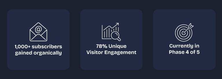
Results & Impact
This phase successfully converted interest into engagement, creating a core audience ahead of the full brand reveal.
The automation workflow and landing page drove consistent growth with minimal effort and zero ad spend.
Key Outcomes:
Strengthened brand presence across platforms
Continued subscriber growth from teaser to launch page
Smooth transition from “curious visitor” to “early community member”
Provided a launch-ready audience for future campaigns
This setup became the bridge between brand discovery and long-term retention, ensuring the hype didn’t fade between teaser and launch.
Live Coming Soon Website
The Coming Soon page is currently live and continues to grow our early subscriber list. It reflects the brand’s tone and offers visitors a way to stay connected ahead of the official launch, bridging interest and loyalty with a single scroll.

Full Website Launch & Restaurant Opening
(Coming soon)
The final stage of this project involves the full launch of the official website and the physical opening of Mad Hatter Bistro.
This phase will integrate everything built so far, brand identity, storytelling, and user engagement, into a comprehensive, responsive website that supports real-world operations like reservations, menu browsing, and interactive storytelling.
The site is currently in development and will be released alongside the grand opening of the restaurant.
Testimonials
My Happy Clients!
INTERESTED IN WORKING TOGETHER?
GET IN TOUCH
CLICK TO COPY
COPIED!🙌