
ContainersWest
Designing a Product Catalog that Sells: Layout, Strategy, and Visual Cohesion for ContainersWest
Client
ContainersWest
Year
2025
Main Tools
Adobe InDesign
Adobe Photoshop
Adobe Lightroom
Topaz Giga Pixel 8
My Role
Graphic Designer
Overview / Brief
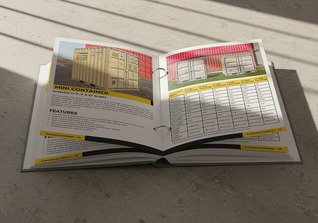
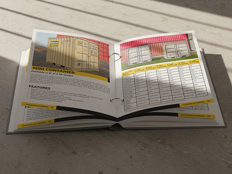
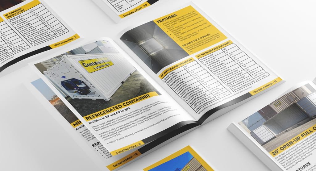
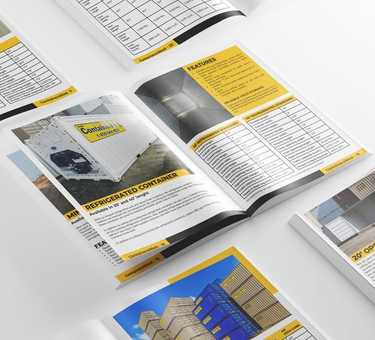
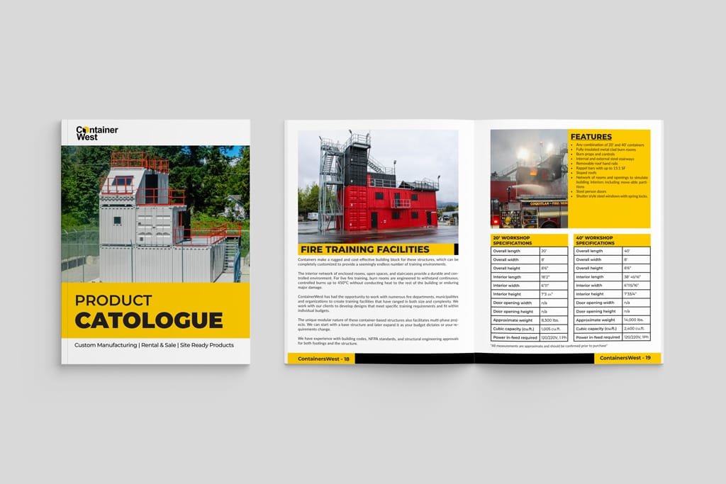
I redesigned the product catalog for ContainersWest, transforming a dated 2017 layout into a modern, branded sales tool. The new design improves readability, visual consistency, and product clarity, supporting both client communications and internal sales efforts. From layout and image editing to copywriting and print formatting, I handled the entire process end to end.
Branding
ContainersWest already had a logo and color palette, their previous catalog lacked visual cohesion and brand presence. My goal was to bring unity and clarity to the document by applying consistent visual elements across all pages.
I implemented a structured layout system, a refined hierarchy of type, and deliberate use of color to support the brand’s identity. Through clean typography, consistent spacing, and carefully edited imagery, the final design presents a stronger, more trustworthy visual language that aligns with the company’s values and services.
Colour Palette
The color palette was inspired by ContainersWest’s existing branding, refined to improve readability and visual hierarchy. Bold blues and cool neutrals create a clean, professional feel aligned with the industrial nature of the brand.
Typography
A simple and modern font pairing was used to ensure clarity across dense product information. Font sizes and weights were carefully selected to guide the reader’s eye and maintain a clean layout throughout the catalog.
Layout System & Grid
A modular grid system was developed to ensure consistency across pages, maintain alignment, and simplify the flow of information. This allowed flexibility in layouts while preserving a strong visual rhythm.
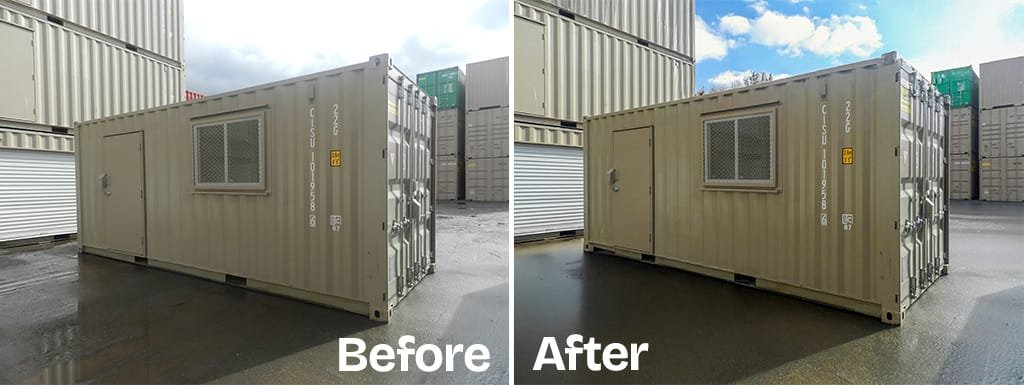
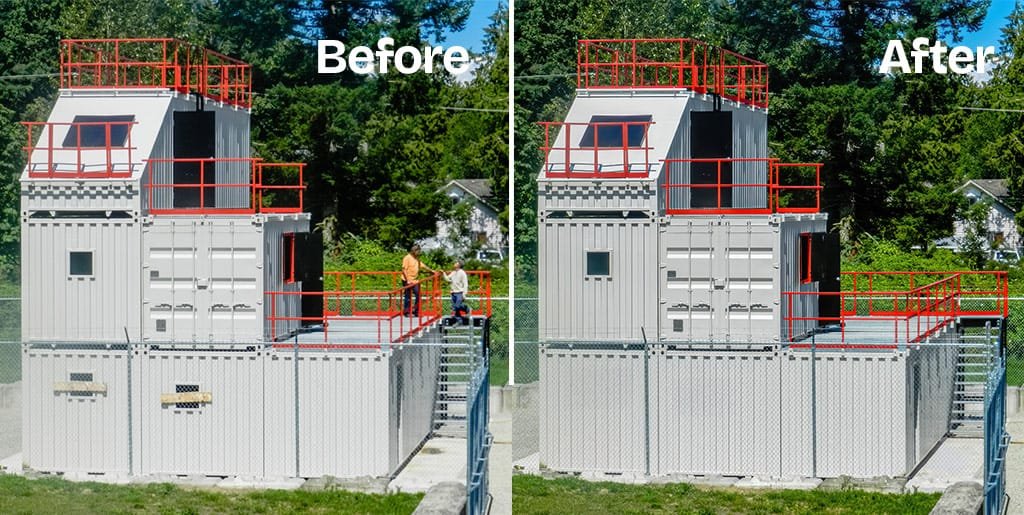
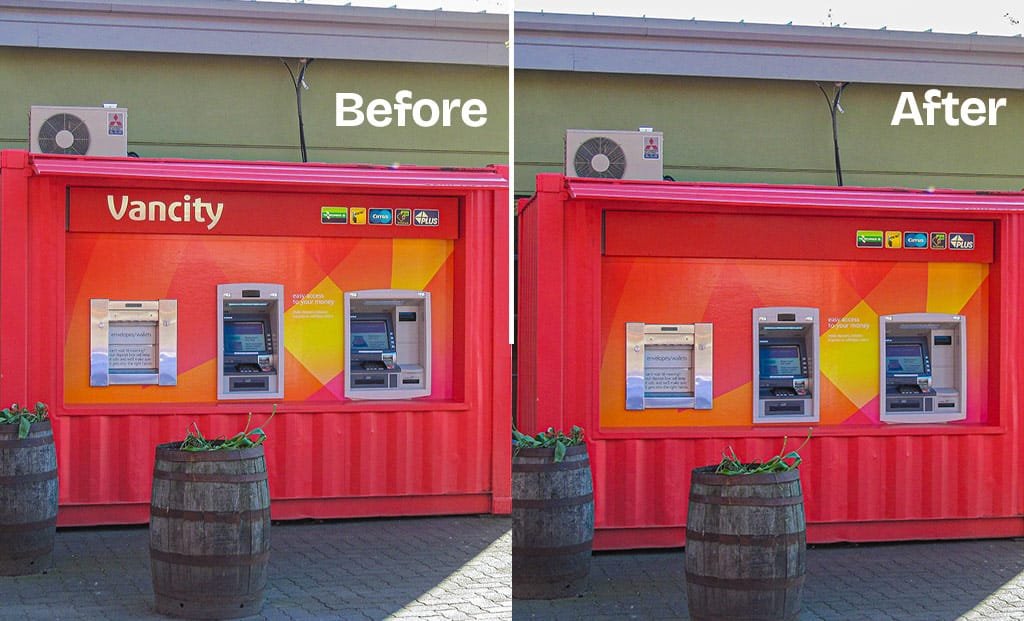
Before & After
I redesigned the product catalog for ContainersWest, transforming a dated 2017 layout into a modern, branded sales tool. The new design improves readability, visual consistency, and product clarity, supporting both client communications and internal sales efforts. From layout and image editing to copywriting and print formatting, I handled the entire process end to end.
Before (The challenge)
The original product catalog lacked consistency, hierarchy, and visual engagement. Content was dense, typography was small, and the layout made it difficult to quickly scan technical details or product benefits. There was also limited brand presence across pages.
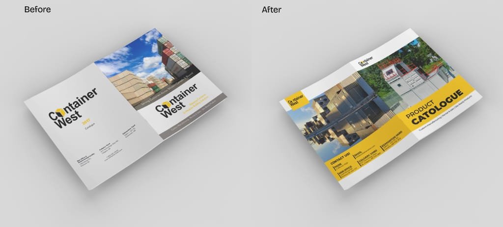
After (The challenge)
I redesigned the entire catalog with a clean layout, refined typography, and an intuitive structure that improves legibility and emphasizes product strengths. The updated visual system integrates Containers West’s brand colors, introduces clear sections for specs/features, and uses high-quality photography with cohesive captions.
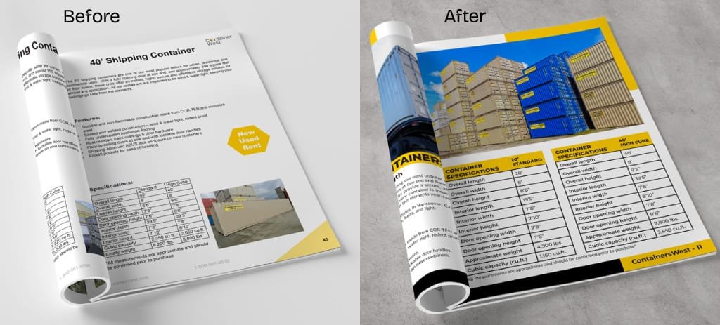
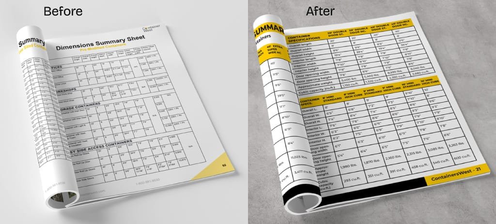
Photo Editing & Print Preparation
To elevate the visual quality of the catalog, I edited and optimized each photo to ensure it met professional print standards. This involved careful adjustments to color balance, exposure, and clarity, as well as precise cropping and alignment to fit the layout structure.
Each image was prepared in high resolution (300 DPI), with accurate proportions and bleed margins to ensure clean and consistent results across all printed pages. This process not only improved visual impact, but also reinforced the catalog’s cohesive and polished appearance.
Testimonials
My Happy Clients!
INTERESTED IN WORKING TOGETHER?
GET IN TOUCH
CLICK TO COPY
COPIED!🙌