1,595
Guests seated through the booking system I built
477
Reservations and counting
2,000+
Subscribers collected before the doors opened
50%
Less time to produce a menu after the template system
THE PROBLEM
Mad Hatter was a dual-concept venue, a daytime bistro and a night lounge built around Alice in Wonderland, and when I started it had no name, no identity and no audience. The brief was harder than a normal brand launch: sell a place nobody had seen, in a category where the competition was running neutral palettes and information-heavy websites. The restaurant needed people already waiting before it opened, and then it needed a system that could keep running every day after that.
THE SOLUTION
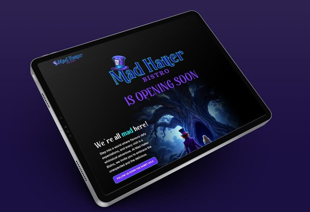
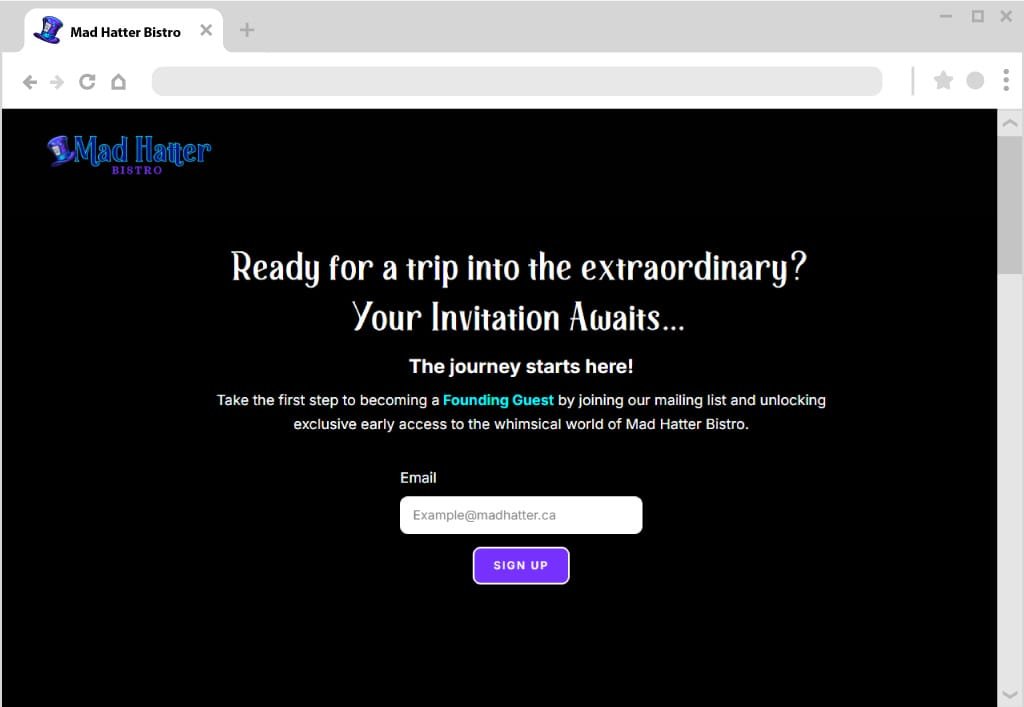
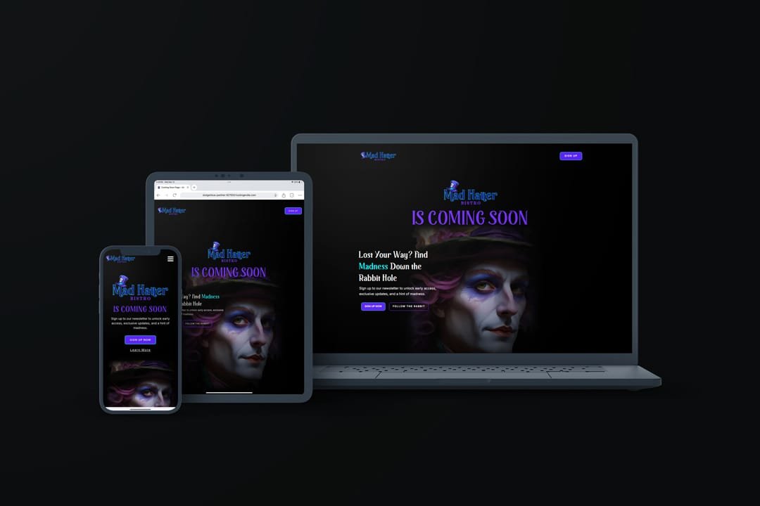
I built it in two halves. Before opening, an identity theatrical enough to sell an experience rather than a menu, and a teaser site with one job, turning curiosity into a mailing list. After opening, the operating system the restaurant actually runs on: the live site, the booking engine, and a modular production system so menus, signage and packaging stay on brand without a rebuild every season.
My role: sole designer. Naming, identity, web, photography, print production, and pre-press, from first sketch to files at the printer.
Delivered: naming · logo and lockups · colour and type system · brand guidelines · teaser site · email capture and welcome automation · full WordPress site · booking system · menus · signage · packaging · social and print campaigns
THE BRAND
The brief was to sell an experience nobody had seen yet, in a category that was all neutral palettes and static websites. I cleared the name against existing marks before we committed to it, then built the system that had to carry the place from a teaser video to a printed menu on a table.

Logo & Imagotype System
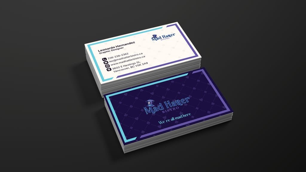
A custom imagotype: a stylized hat paired with an expressive serif wordmark. The hat carries the name on its own, which matters for a venue that lives on signage, menus, packaging and a small social avatar. Stacked and horizontal lockups cover every placement.

Colour
Deep purple, electric blue and turquoise on a dark navy base, with ivory white for contrast. The category was beige, black and muted gold, so the palette is the first thing that separates Mad Hatter from the restaurant next door, and it holds from the video and the site through to signage and print.

Typography
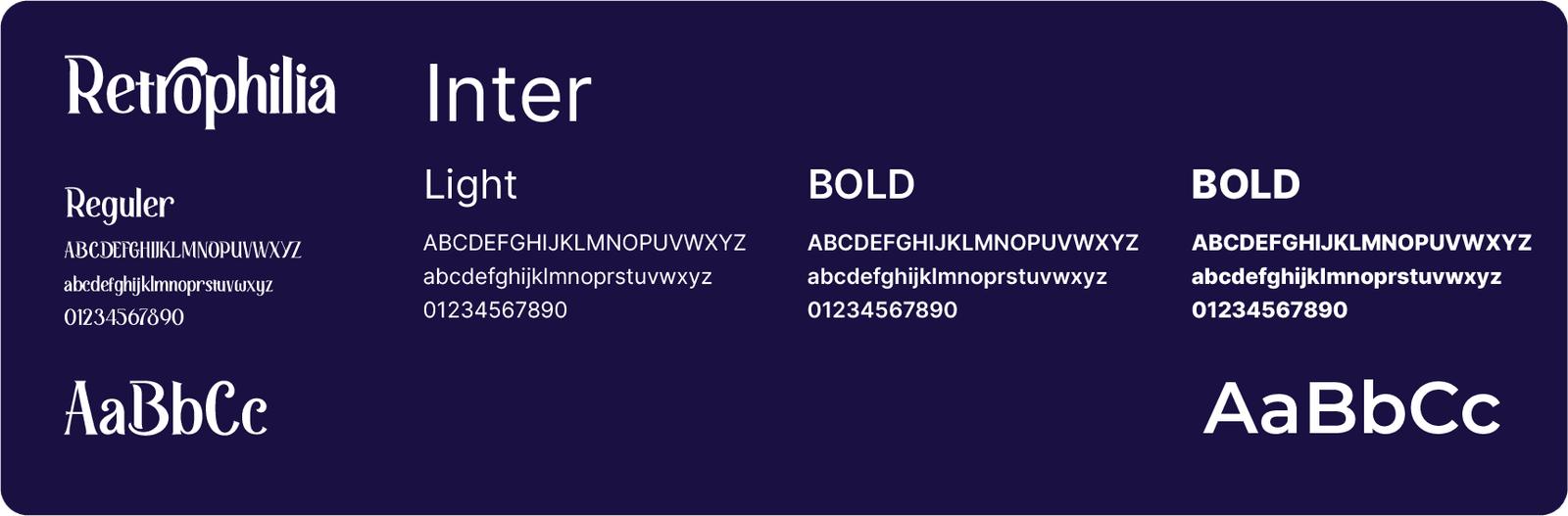
Retrophilia for display, for ornamental curves that carry the theatrical side. Inter for body copy, signage and UI, because it stays legible at small sizes and on a phone in a dark room. One face with personality, one that gets out of the way.
Brand in Use
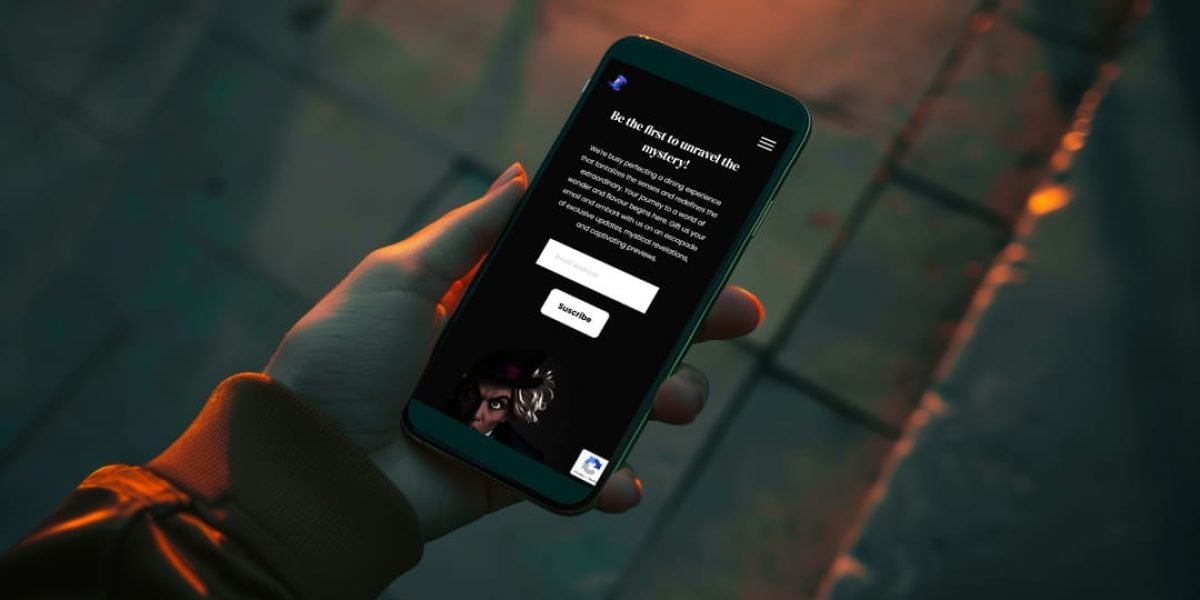
The system across the teaser site, social, print, signage, and packaging.

OPENING AND AFTER: The Brand That Runs Every Day
A teaser site proves you can build anticipation. What came after proves the brand survives contact with a working kitchen.
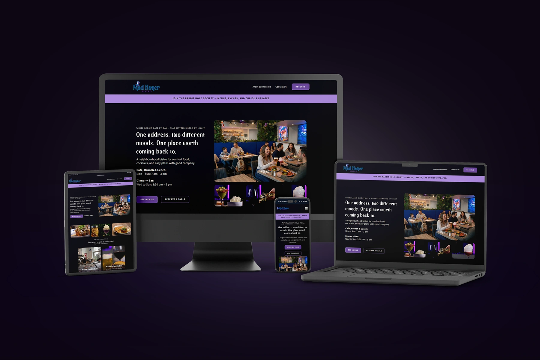
I built the full WordPress site and the reservation system the restaurant runs on, from software selection through build, integration and staff training. It has since seated 1,595 guests across 477 bookings.
Then the production problem. Menus changed with the season and with pricing, and every change was turning into a rebuild. I built a modular, print-ready template system in InDesign that absorbs a new dish or a new price without touching the layout, and menu production time dropped by half.
The last piece was consistency. Menus, signage, packaging, print and social now run on one identity, and every file goes through a brand and pre-press review before it is released. There have been no reprints since.
I also shot and retouched the restaurant’s food and location photography through launch, grading in Lightroom and Photoshop to one look so the site, the menus and the social channels stopped reading as three different brands.
WHAT IT BECAME
I worked with Mad Hatter as an outside designer for sixteen months. In January 2026 they brought the role in-house, on the strength of the brand and the results above.
05.
Testimonials
What it's like to work with me
I entrusted Leo with the complete development of our digital presence and supporting systems… Leo took full ownership and delivered successfully. I would confidently entrust him with the same responsibility again.

Sebastien Jutras
Owner, Mad Hatter Bistro
He approaches each task with creativity and out-of-the-box thinking, while remaining open to coaching and feedback. I would be thrilled to work with him again.

Teela Hudak
Fund Develpment, Progressive Housing Society
He deeply understood my vision and brought it to life through a brand and website that reflect not only my philosophy of growth and connection with nature, but also my identity as a coach.

Carolina Rivera
Owner, True Nature Coaching
06.
Contact Me
Let's talk
Click to Copy!
Yes, just click. Magic.
Email Copied!🙌
leonardohernandez@leohdesigns.com
I’m looking for a full-time graphic and web design role in Metro Vancouver. Happy to talk about project work too.